When you explore the world of colours, you will realize that there are no limits. By going with the colours, you will feel like diving more into the exceptional world.
Colours are an important aspect of life because they make things most significant and expressive. The colourful object appears more revealing and soothes the eye.
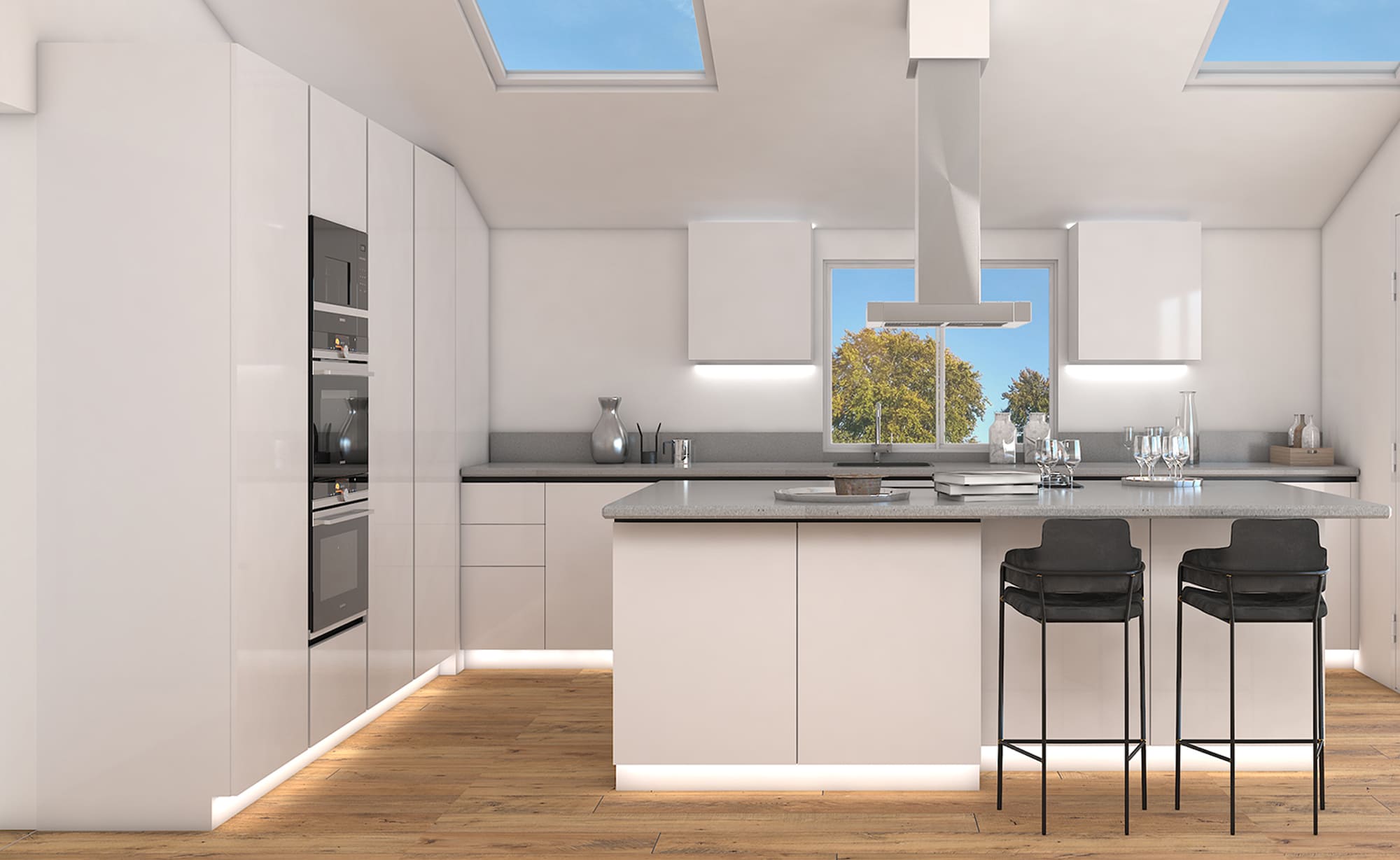
A kitchen is the heart of every house and the correct combination of colours brings the soul into the place. Colours affect thoughts and moods and when we choose the best combinations for the kitchen, they can fill the entire place with joy and compassion.
All colours are beautiful, it is the matter of contrast and shades that are used with certain combinations. Kitchen units can have a great combination of colours and the colour of kitchen tiles must be selected accordingly.
When choosing the colour contrast for the tiles, always keep in mind the shades of the kitchen units. The wrong choice of colour results in poor reception and work experience for an individual.
SHADES OF BLUE
1. SAPPHIRE BLUE
The sapphire colour is one of the lovely shades of blue. The royal and elegant touch transforms the cuisine into a delicious and enjoyable sensation. It imparts a soft tone and luxurious texture in contrast to the cream kitchen units. The name and colour refer to a gemstone called sapphire.
With a regal and precious backbone, the sapphire blue tiles will give an expensive and sleek finish to the kitchen.
2. STEEL BLUE
It is a blue-grey shade of blue and looks fabulous with cream while leaving a matte finish. A Kitchen when painted with steel blue looks less vibrant but more decent. Steel-blue combines well with neutral colours for a similar look.
3. SOFT BLUE
The soft blue is one of the most beautiful shades of pastel blue that gives a bright and expanded view of the tiles of a kitchen.
It’s a great choice for blue lovers.
Cream kitchen units along with soft blue spread a beautiful vibe of classic and calm outlooks.
4. TURQUOISE
One of the magnificent shades of blue-green, turquoise combines easily with the cream kitchen units.
This colour will lead you through beautiful views of the oceans and deep thoughts.
SHADES OF GREEN
1. PINE GREEN
The Pine is a cool tone colour of green and resembles the colour of a pine tree.
It is a type of shade that you can choose for cream kitchen units blindly without any doubt.
The green colour is known to refresh the spirit, hence the cuisine with pine tiles will have revival effects.
You will feel energetic while working in the kitchen pine coloured tiles.
2. PALE SPRING BUD
Spring green or pale spring bud is a light shade of green and unite well with cream colours.
The spring green coloured tiles cool the environment with greater echo effects.
A kitchen with a light spring bud provides a rustic and earthy sensation.
3. CHARCOAL GREEN
Charcoal green gives surprising effects on walls and tiles by leaving a graceful texture. A Kitchen will spread love and fantasy with darker shades of charcoal green. You can contrast it with lighter shades and thus a perfect match for cream kitchen units.
4. FOREST GREEN
Another pathway to jump into the beauty of nature is by picking up the superior shade of forest green. It is the right display for open kitchens, having decorations of plants and herbs.
Cream kitchen units stand out when equipped with forest green coloured tiles.
SHADES OF GRAY
1. PALE SMOKES
Pale smoke is a perfect combination of creamy kitchen units and is a cool shade of grey and is enough for making calm and relaxed surroundings. It gives smoky and matte finishes and people who love sober and splendid things can go with the combination of pale smoke tiles and creamy kitchen units.
Having a nice slight shade, it blends well with the cream kitchen units.
2. VICTORIAN PEWTER
To bring decent and breathtaking views of kitchen tiles having creamy units, one must never think twice while going with Victorian pewter.
The tiles painted with this shade create a vision of larger and expanded space.
3. MOTH GREY
Moth grey is a delicate and mid-tone shade of grey. The tiles with painted moth grey work wonders in open kitchens. The best choice, to give a softer and lighter appearance.
4. SILVER CHARM
The kitchen tiles having silvery charm pairs well with the cream kitchen units. It gives breathtaking effects inside the kitchen. The silver charm is a perfect choice for a contemporary and aesthetic kitchen theme.
SHADES OF PINK
When talking about pink, it is not a single colour. The pastel tones of pink bring harmony to the creamy units of a kitchen.
1. CRYSTAL PINK
The pastel hue of crystal pink delivers compassion and joy when painted on tiles with creamy kitchen units.
As the two shades are lighter and make the kitchen attractive and balanced.
2. ROSE QUARTZ
As its name implies, the colour comes from a crystal family and blesses the kitchen with more love and generosity. When used with cream kitchen units, it brings grace and calmness into the atmosphere.
3. DARK HOT PINK
Hot pink is the ultimate choice among pink shades. The darker bright pink colour painted on the tiles gives an effective look that attracts the eye. The combination provides a versatile and lively setting for a kitchen.